What should a plumber’s logo look like?
Not a water drop. Not a tap. Not a cartoon flame. Here’s what actually makes a plumbing logo work on a van, a polo shirt and a Google listing.
Picture the last five plumbing vans you saw. How many had a water drop on them? A tap? A flame? A little house with a roof?
That’s the problem. When every plumber uses the same handful of pictures, none of them stick. A good plumbing logo has to do the opposite: be obviously yours, and still make it clear what you do.
The clichés to skip
- Water drops and splashes. The most common plumbing logo there is.
- Taps, pipes and wrenches. Fine as a clue, forgettable as a logo.
- Cartoon flames. Every heating engineer’s first idea.
- The little house. Used by every trade, so it says nothing about yours.
- Blue and more blue. If every van on the estate is blue, yours disappears.
None of these are banned. They just make you look like everyone else, which is the opposite of the job.
What a good plumbing logo does
- Puts your name first. It’s what people search for and what they tell the neighbours.
- Says “plumbing” and “heating” in words. Words are clearer than pictures, and you don’t need a tap if the word plumbing is right there.
- Reads at 30mph. Bold, simple letters that work across a van from the other side of the road.
- Works in one colour. It has to embroider on a polo, print on a quote and sit in a tiny Google profile picture.
- Leaves room for Gas Safe. Your accreditations matter to customers. They need a tidy, consistent spot, not squashing in wherever there’s a gap.
A clever detail beats a literal picture
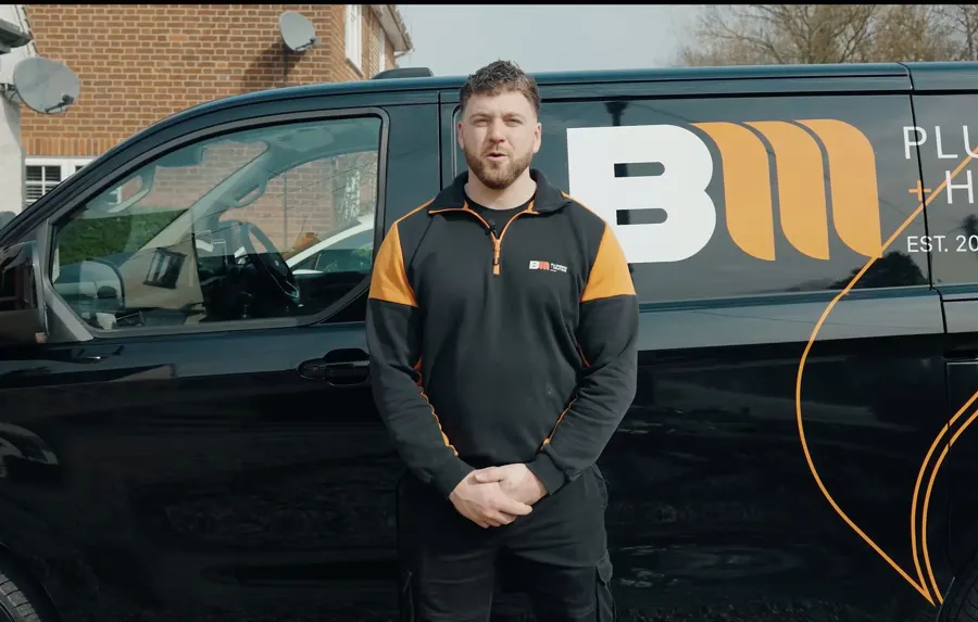
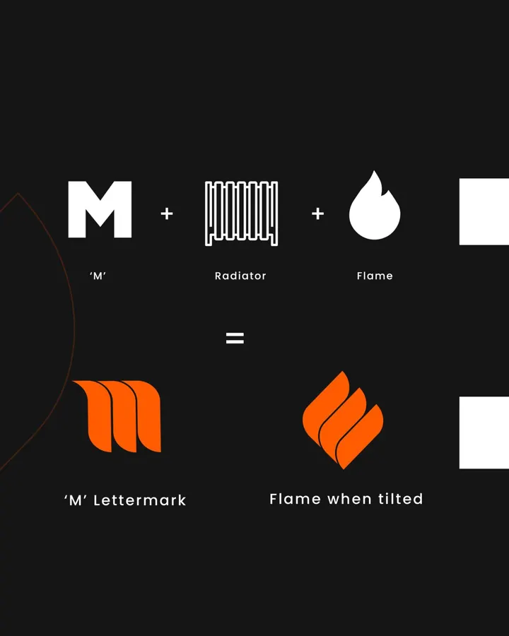
When Brendan set up BM Plumbing + Heating, he didn’t want a tap. We built him a BM monogram instead, and the M is made of three shapes that echo a radiator’s sections and, turned on its side, a flame. Plumbers spot it straight away. Customers just see a sharp, confident brand.
That’s the trick: one small idea that belongs to you, rather than a picture that belongs to everyone. Brendan now has 44 five-star Google reviews, and customers keep mentioning how professional he is. The brand said that before he’d turned up.
Colours that stand out
Look at what the plumbers in your area use and go somewhere else. Bold orange, deep green, black, even a warm yellow will stand out on a street full of blue vans. Pick one strong main colour and one or two supporting ones, then use them the same way everywhere.
A quick checklist
- Can you read the name from across the road?
- Does it still work in black and white?
- Is it clear you do plumbing and heating without a clipart tap?
- Would it look right on a £50k job, not just a dripping tap?
- Is there anything in it that only you could have?
If you can tick all five, you’re in good shape. If not, have a look at our branding for plumbers, or send us a photo of your van and we’ll give you honest feedback and a few ideas, for free.
Not sure what you need?
Send us your logo, van or cards and we’ll tell you honestly what would make the biggest difference.