Back to projects

BM Plumbing + Heating

Location
Essex + Suffolk
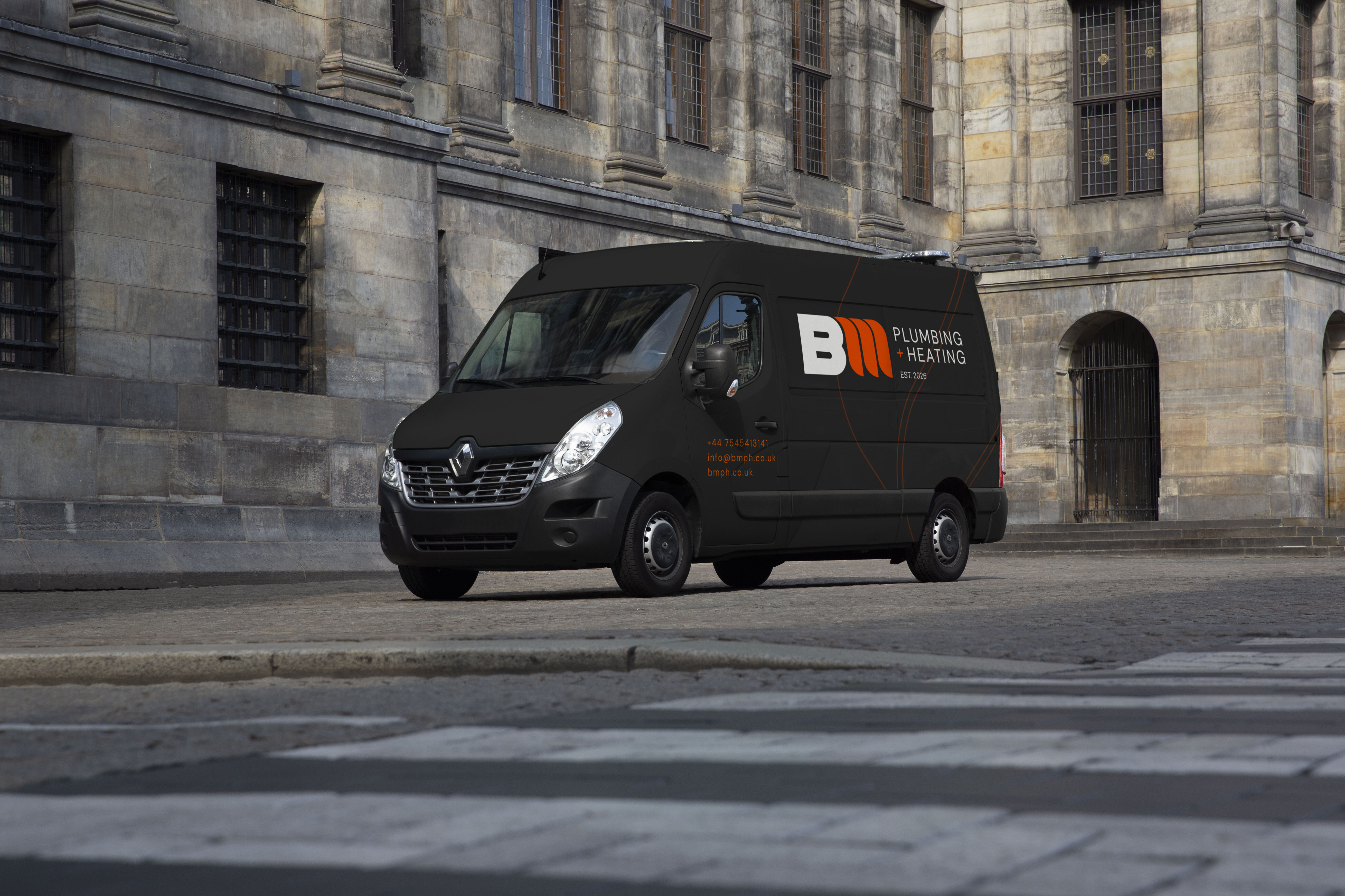
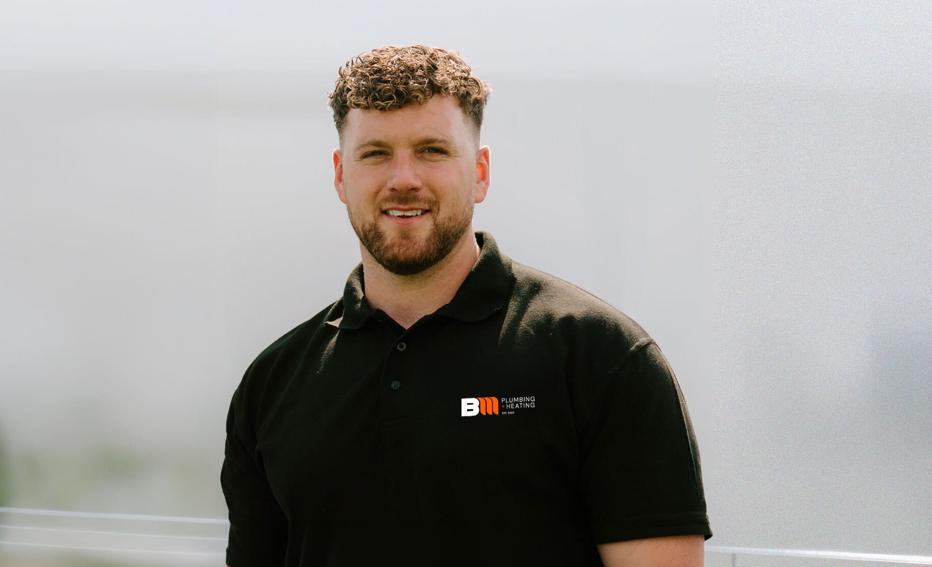
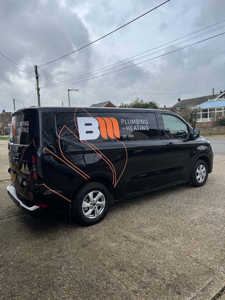
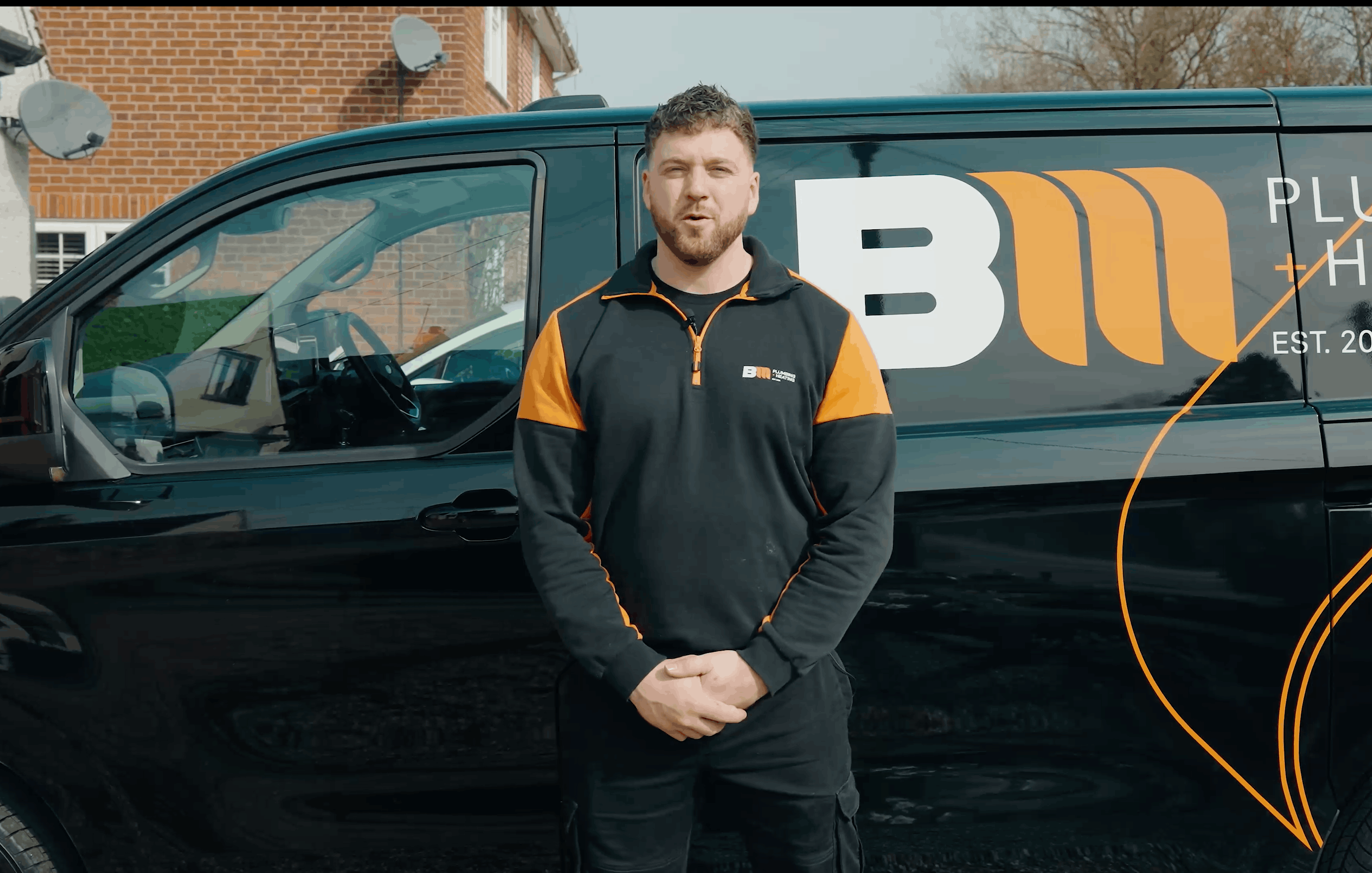
Brendan was setting up on his own. A new business under his own name, and one opportunity to look established from the start. He needed an identity that felt professional from day one without losing what makes an owner-led business different: customers deal directly with the person responsible for the work. It had to communicate both sides of the service clearly, work across vans, workwear, paperwork and digital, and stand apart from generic trade branding.
How we helped
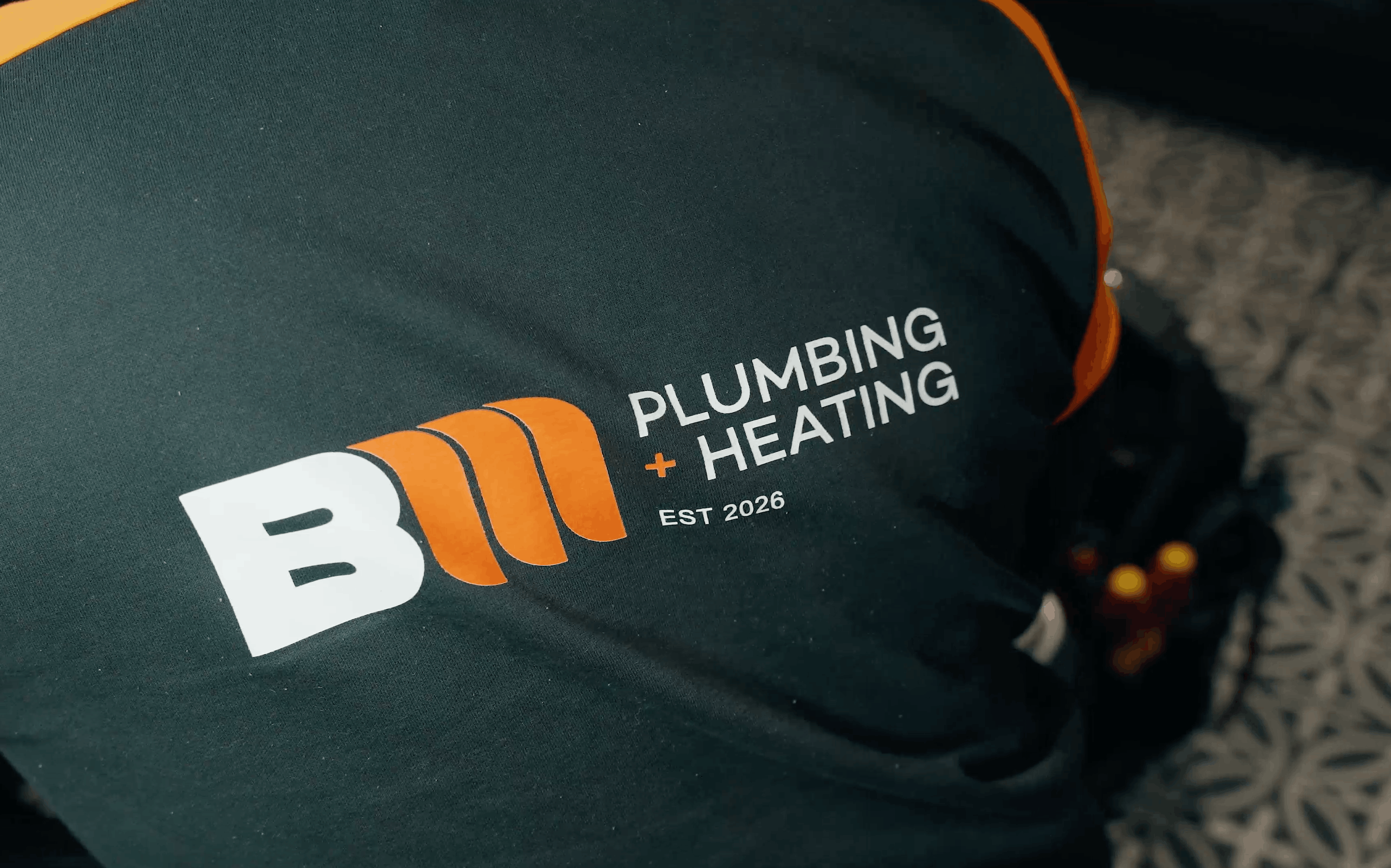
We built a BM monogram designed to work like a personal stamp, reflecting the accountability that comes with Brendan's name on the business. The M is constructed from three geometric forms that echo the structure of a radiator. A deliberate reference to the trade rather than a literal tool symbol. Bold orange and black form the core palette, supported by galvanised grey, green and water blue, with DM Sans across the type system. We extended the shapes within the monogram into a set of supporting graphics, so the brand holds together in applications where the logo alone is not enough.
The result
The identity now sits at the centre of the business, supporting plumbing, heating and renewable energy services across North East Essex and South Suffolk. As of July 2026, BM Plumbing + Heating holds a 5.0 rating across 37 reviews, with customers consistently citing responsiveness, clear communication and quality of workmanship. Those are the qualities the identity was built to signal from the outset. The reputation now confirms it.
next project
next project
next project
next project
next project
next project
next project
next project
next project
next project
next project
next project
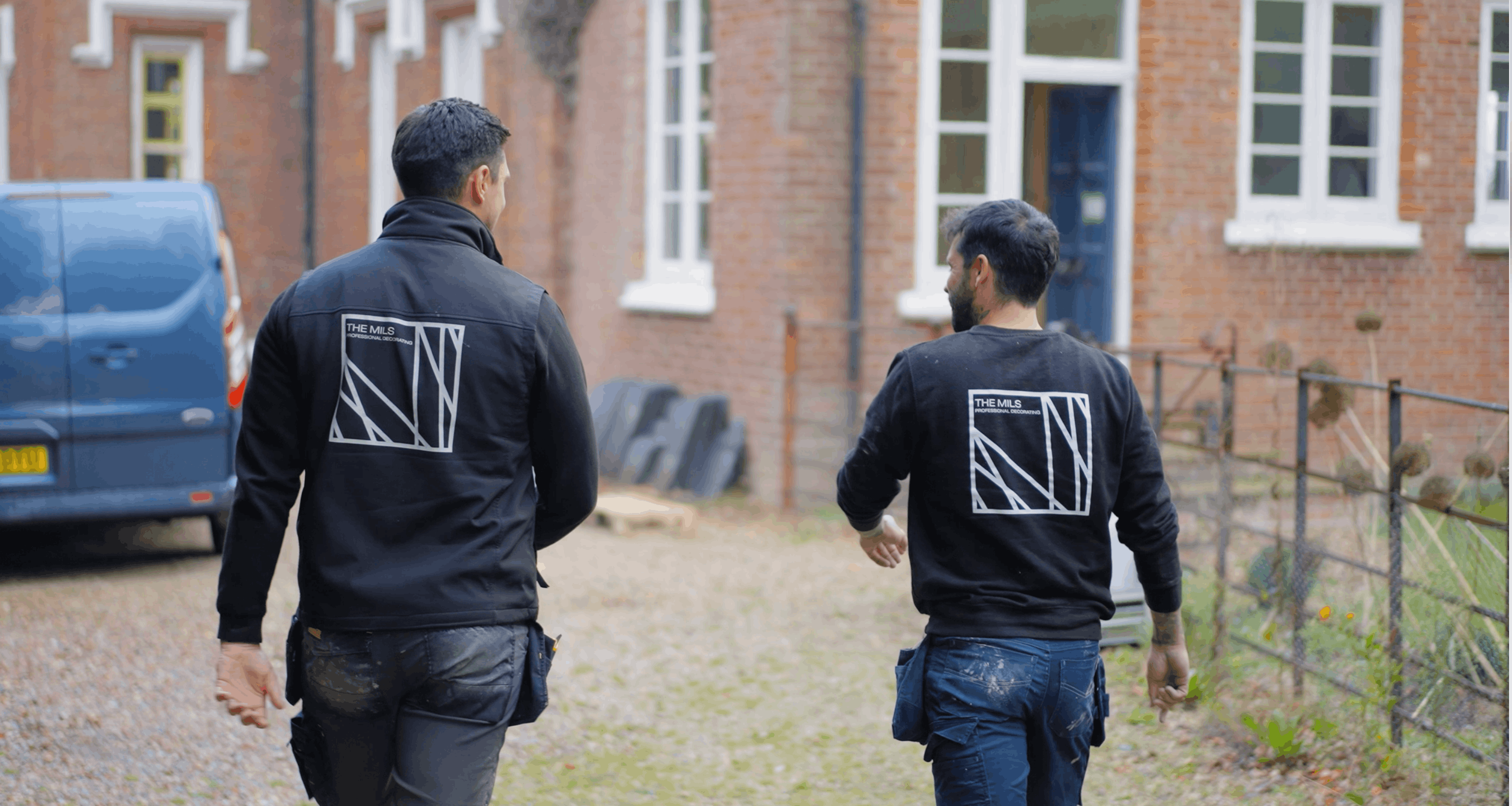
The Mils
A decorating brand that looks nothing like a decorating brand.
Interior & exterior decorating