Back to projects

Watts Carpentry + Construction

Location
Essex + Suffolk
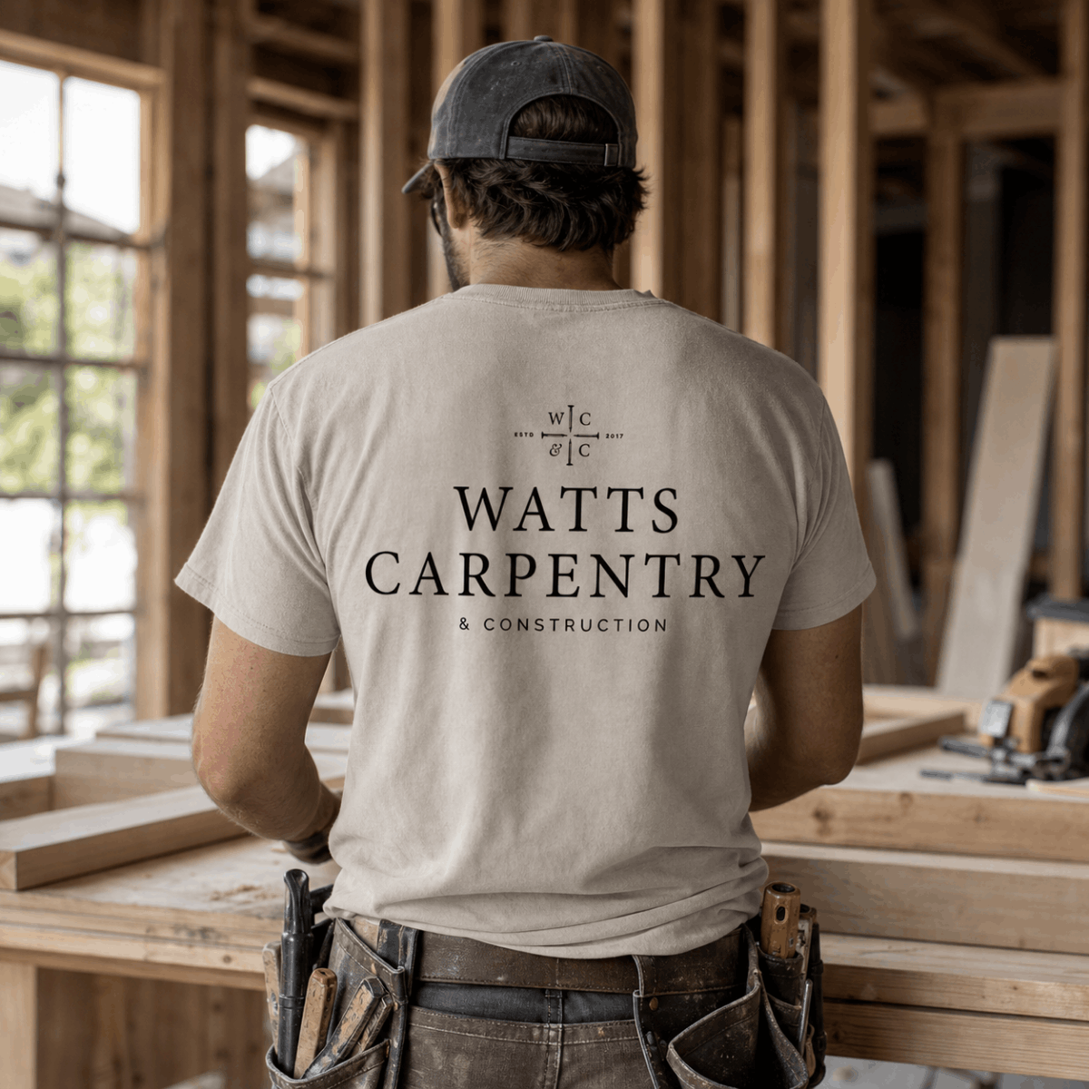
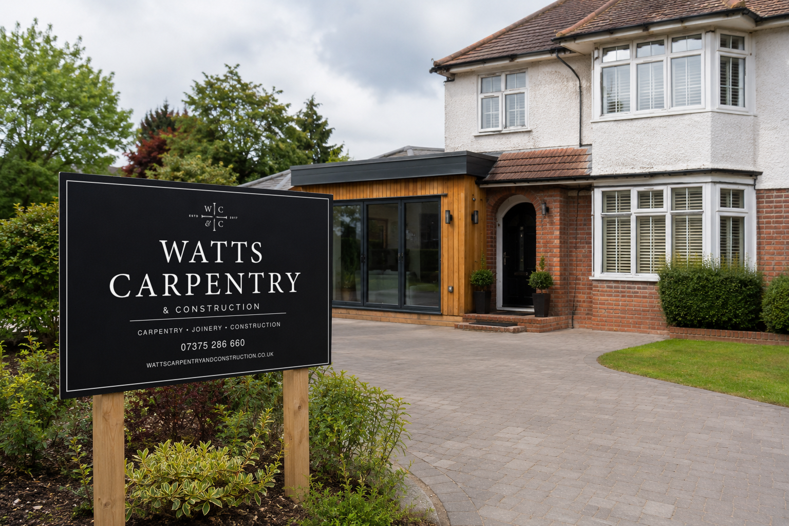
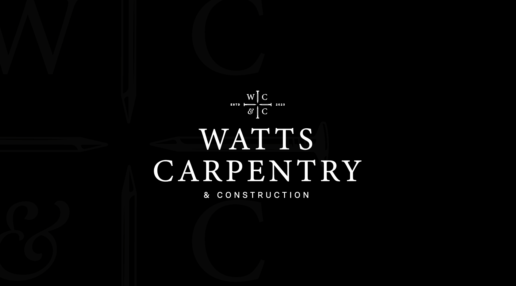
Brad wanted the business to look established. Refined typography, simple layouts, and an established date to signal experience. No bright colours and nothing overly modern. A confident black and white direction that felt timeless. The difficulty with carpentry branding is that it usually defaults to a collection of tools or an overly rugged aesthetic. He wanted neither, while still making the trade immediately clear.
How we helped
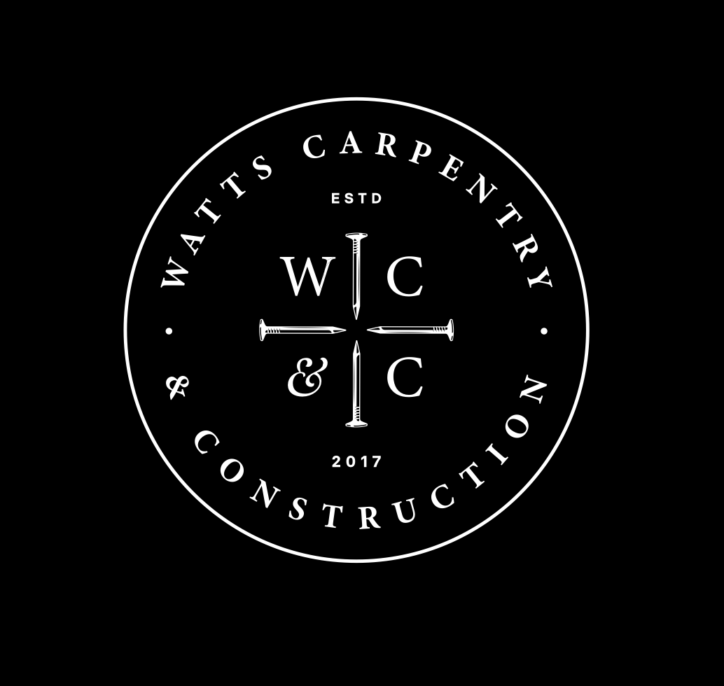
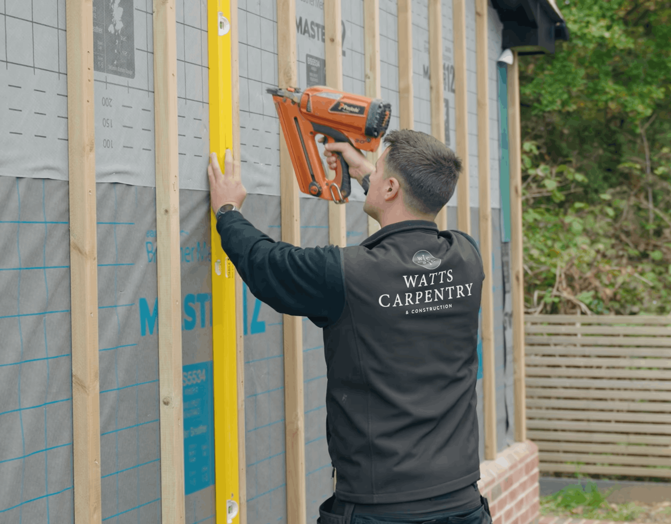
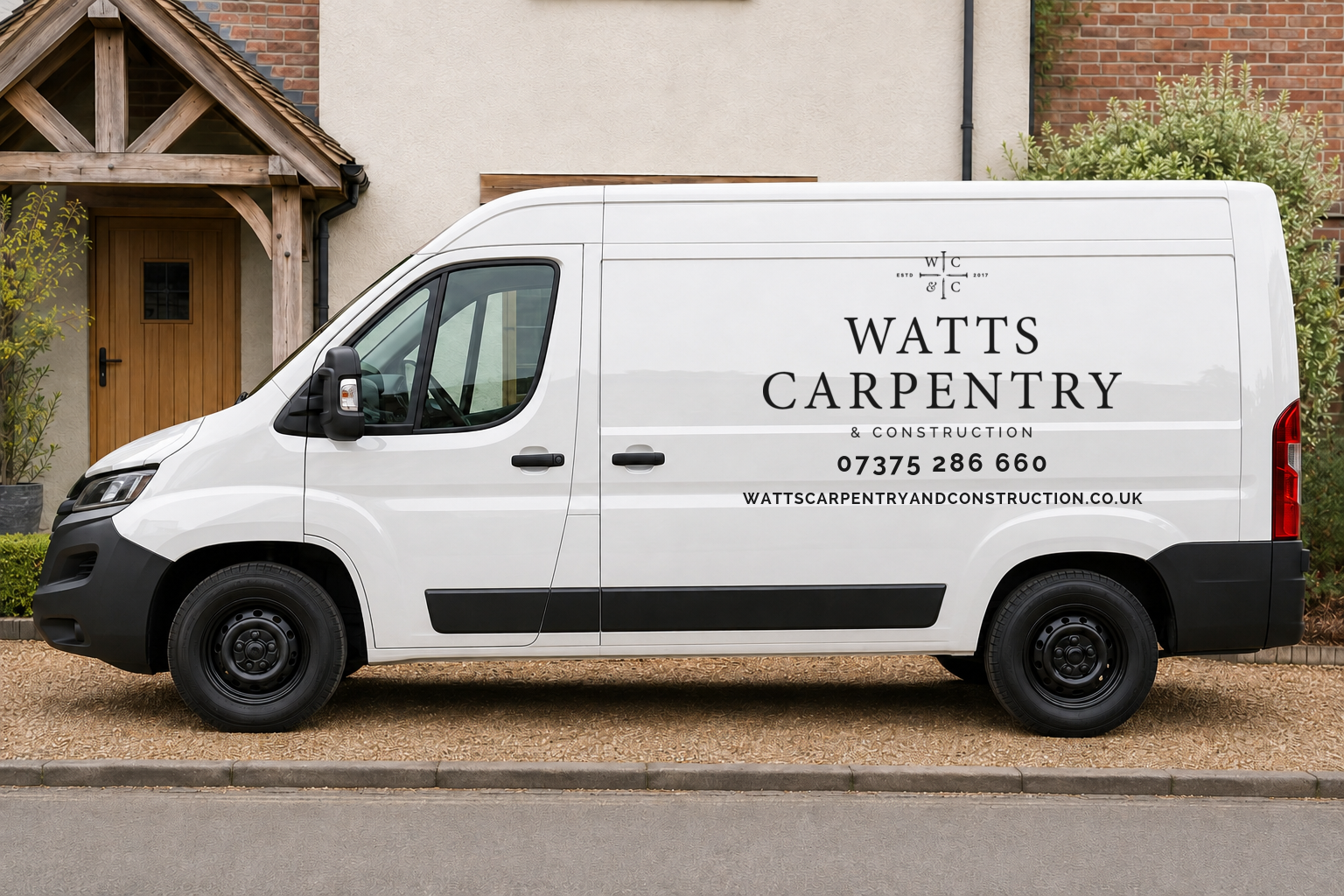
The chosen route was a bespoke WC&C monogram, with four carefully positioned nails dividing the initials. The trade reference sits within the mark itself rather than beside the name, and the nails communicate precision and structure. Qualities that reflect the standard of Brad's work. We paired it with a classic serif wordmark and included Est. 2017, so the identity carried the weight of his experience rather than reading as a new venture. The system covers a stacked logo for larger applications, a horizontal variation for wider spaces, a circular badge for social profiles, and a simplified monogram for smaller formats. The badge was designed to read as a stamp of approval. Minion Pro and Raleway set the typographic hierarchy, and we supplied basic guidelines with every asset organised and ready to use.
The result
The identity now runs across the website and social channels, and the business has expanded well beyond joinery into garden rooms, media walls, oak structures, staircases, cladding, and timber frames and roofs, serving Essex, Suffolk and London. The system carries all of it without modification. Brad passed the files straight to his website designer with everything needed to take the brand forward.
next project
next project
next project
next project
next project
next project
next project
next project
next project
next project
next project
next project
The Mils
A decorating brand that looks nothing like a decorating brand.
Interior & exterior decorating