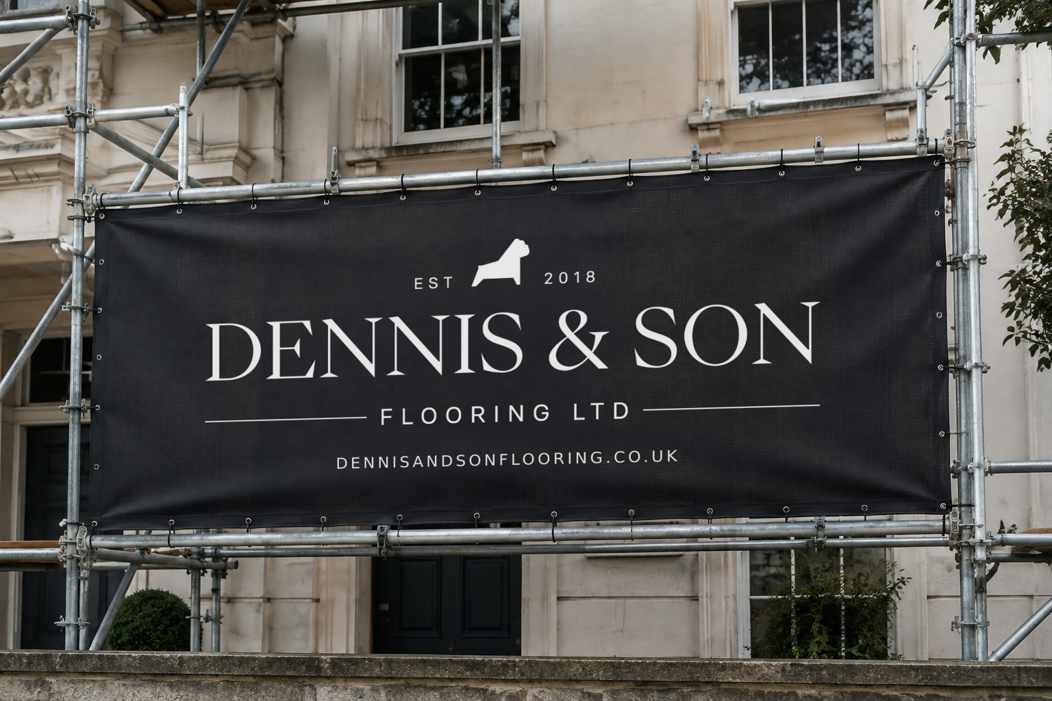
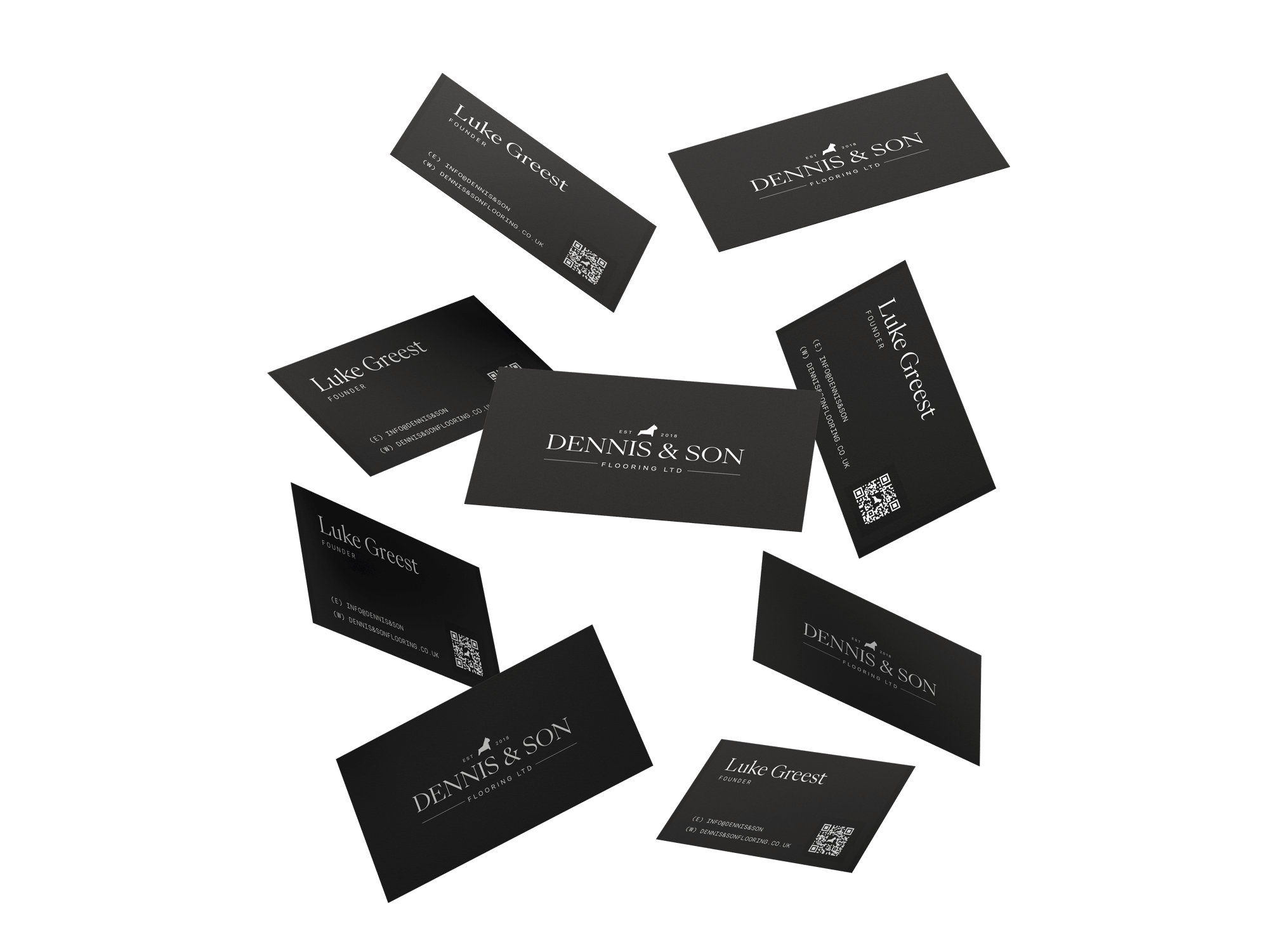
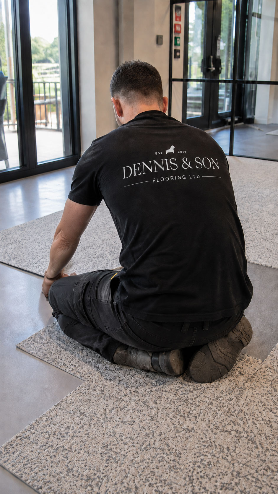
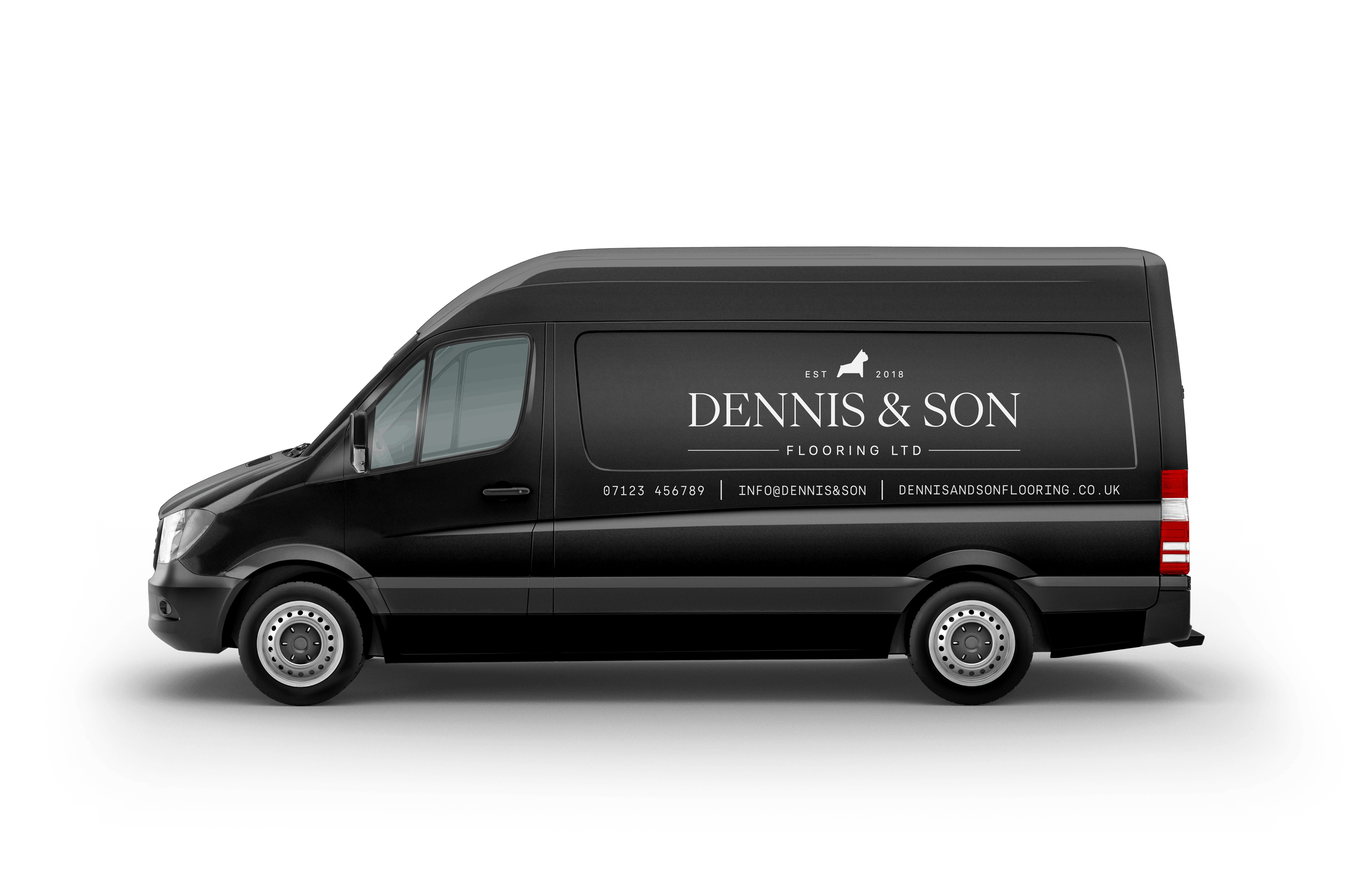
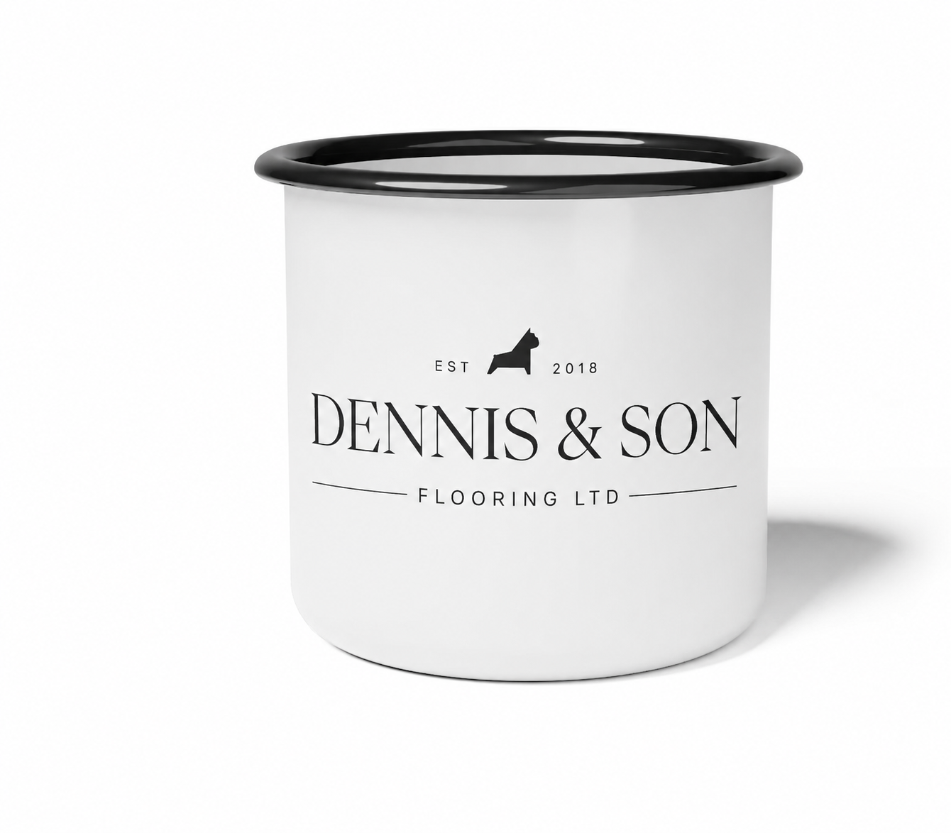
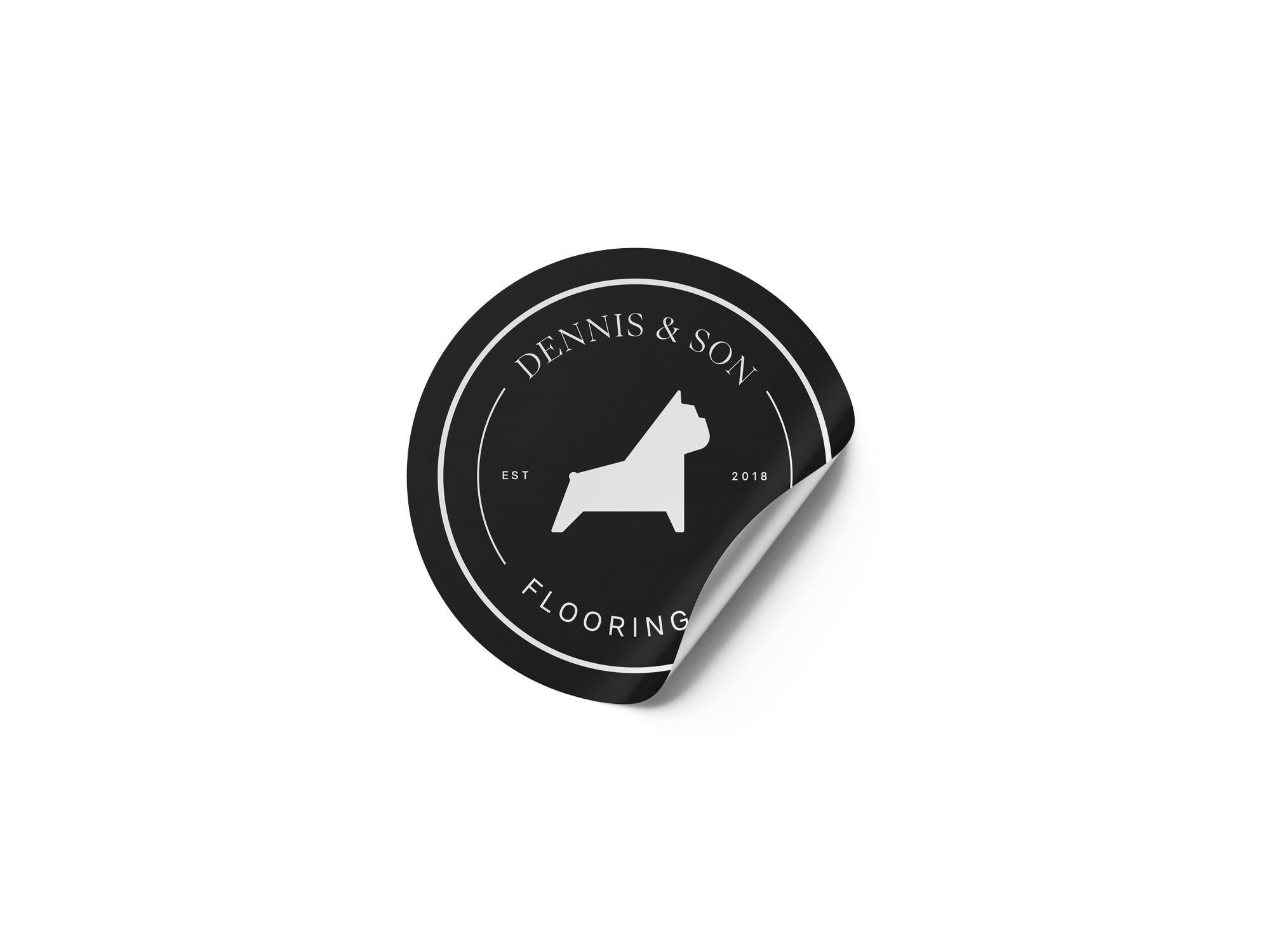
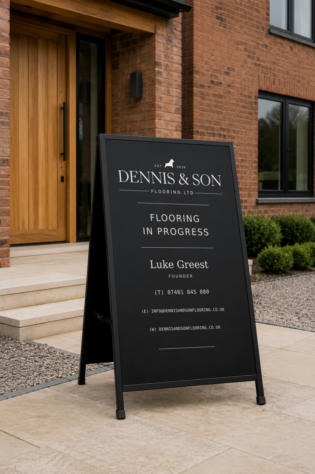
The strongest route came from an unexpected direction. We distilled Bizzy, the French Bulldog from the previous business, into a minimal silhouette. It preserved the part of the company's history worth keeping and gave Luke a symbol nobody else owns. We paired it with a high-contrast serif wordmark, fine dividing lines and an Est. 2018 detail, held in a restrained black and white palette. The system includes a horizontal wordmark, a mascot lock-up, alternative typographic treatments and a circular badge, so it performs across vehicle graphics, workwear, print and smaller digital applications. We then extended it into a premium business card: black, heavyweight, rounded corners, the bulldog on the reverse, and a QR code linking to the website, contact details and social channels. We sourced and tested plastic, heavyweight and soft-touch stocks with Luke before the full print run, so the finished item matched the standard of the brand.
.svg)