Location
Essex + Suffolk
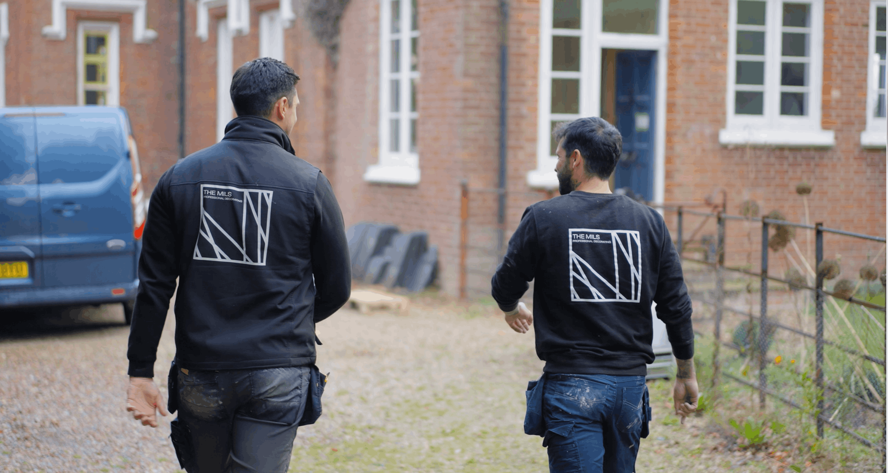
Aaron and Josh had built the business on quality craftsmanship, attention to detail and dependable customer care. The branding communicated none of it. They needed an identity that appealed to clients looking for a premium decorating service and supported a longer-term ambition of becoming a nationally recognised name, without losing the personal approach that had won them the work in the first place.
How we helped
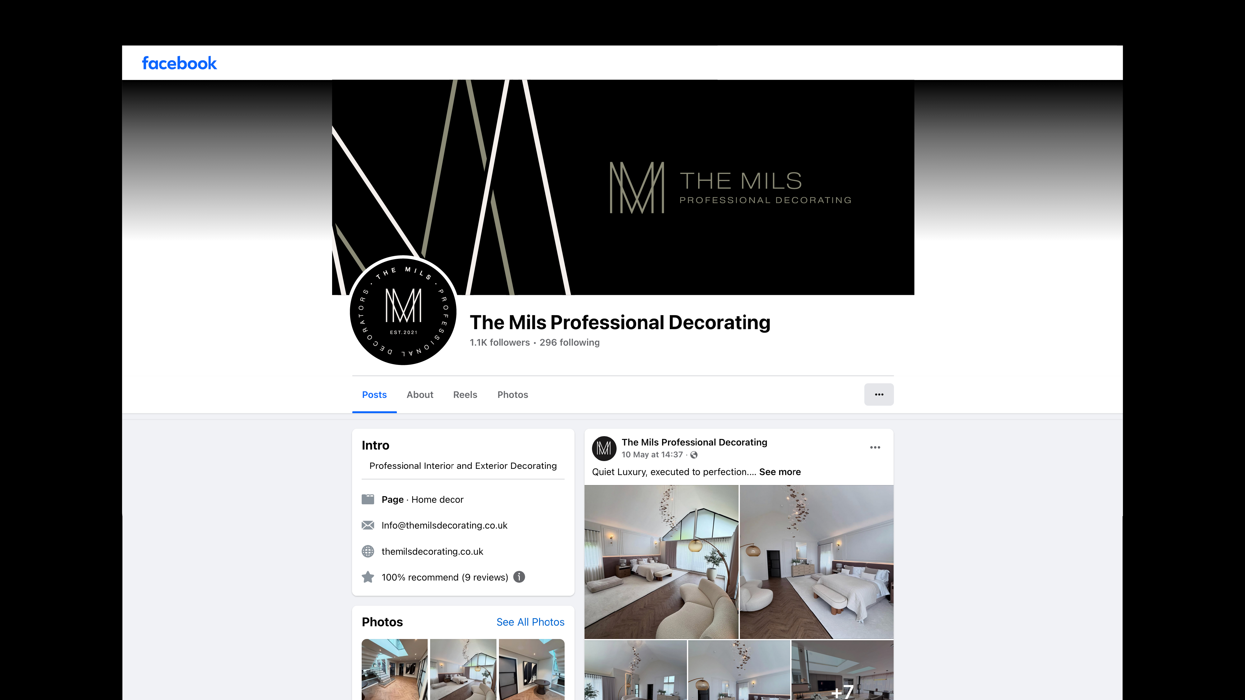
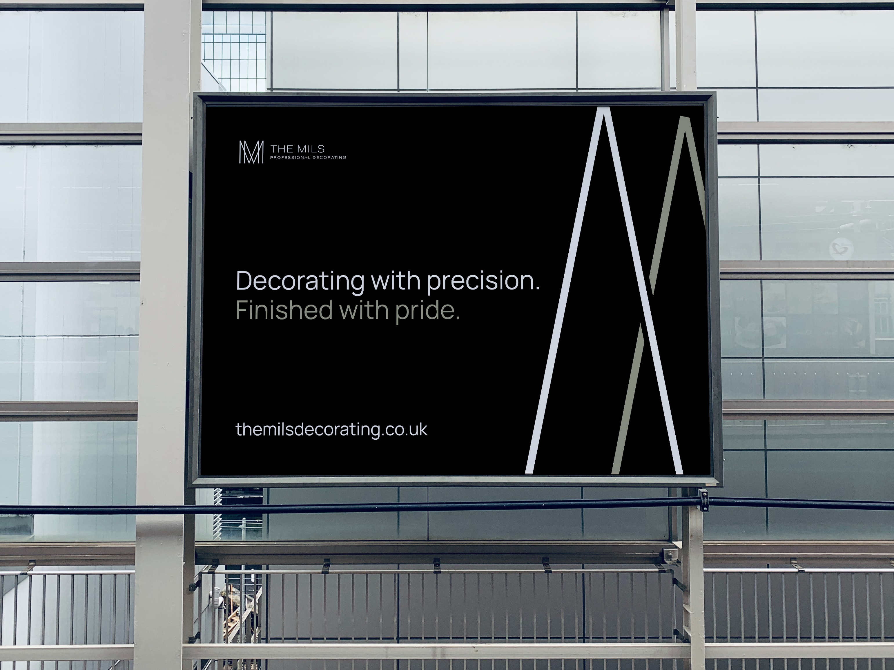
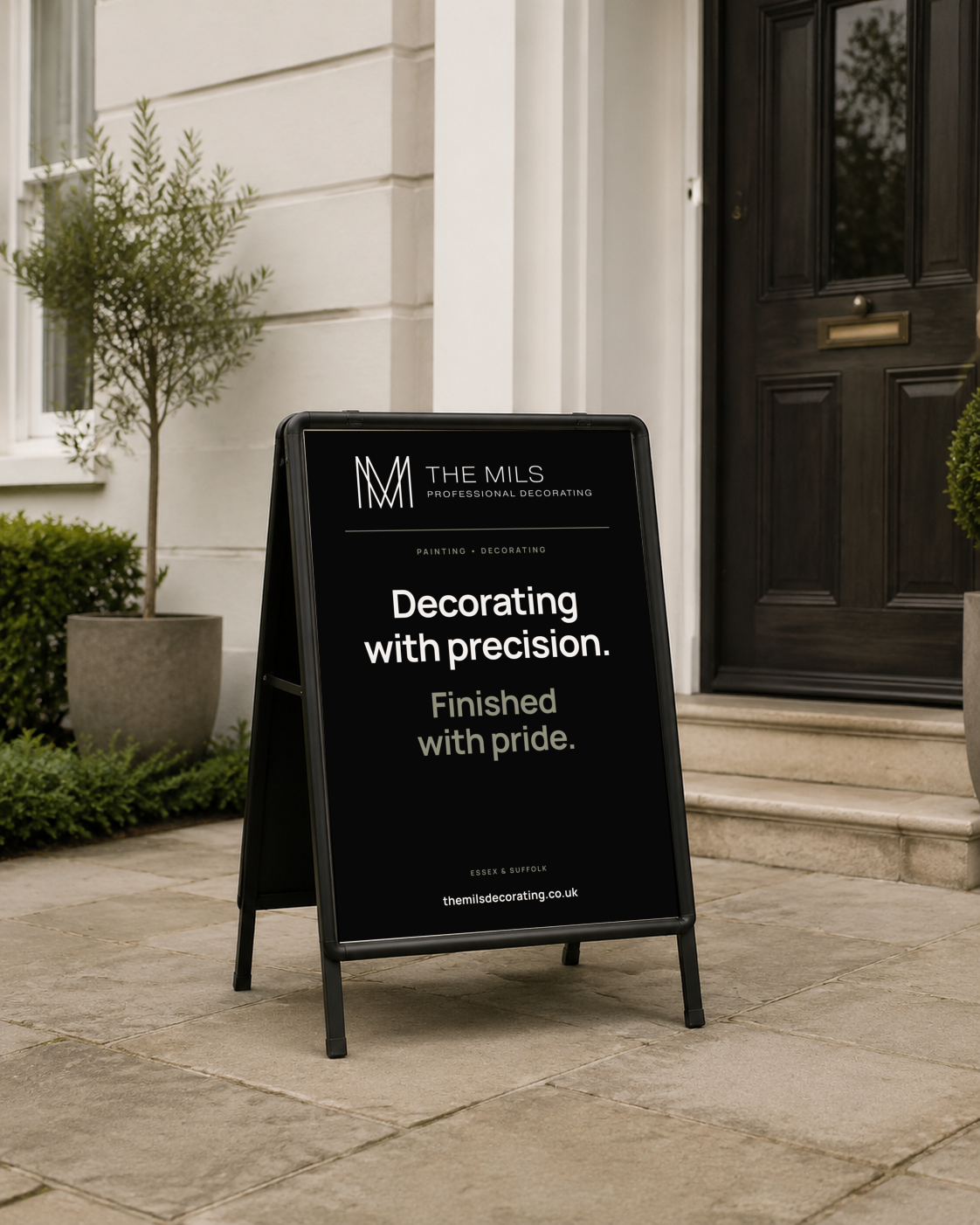
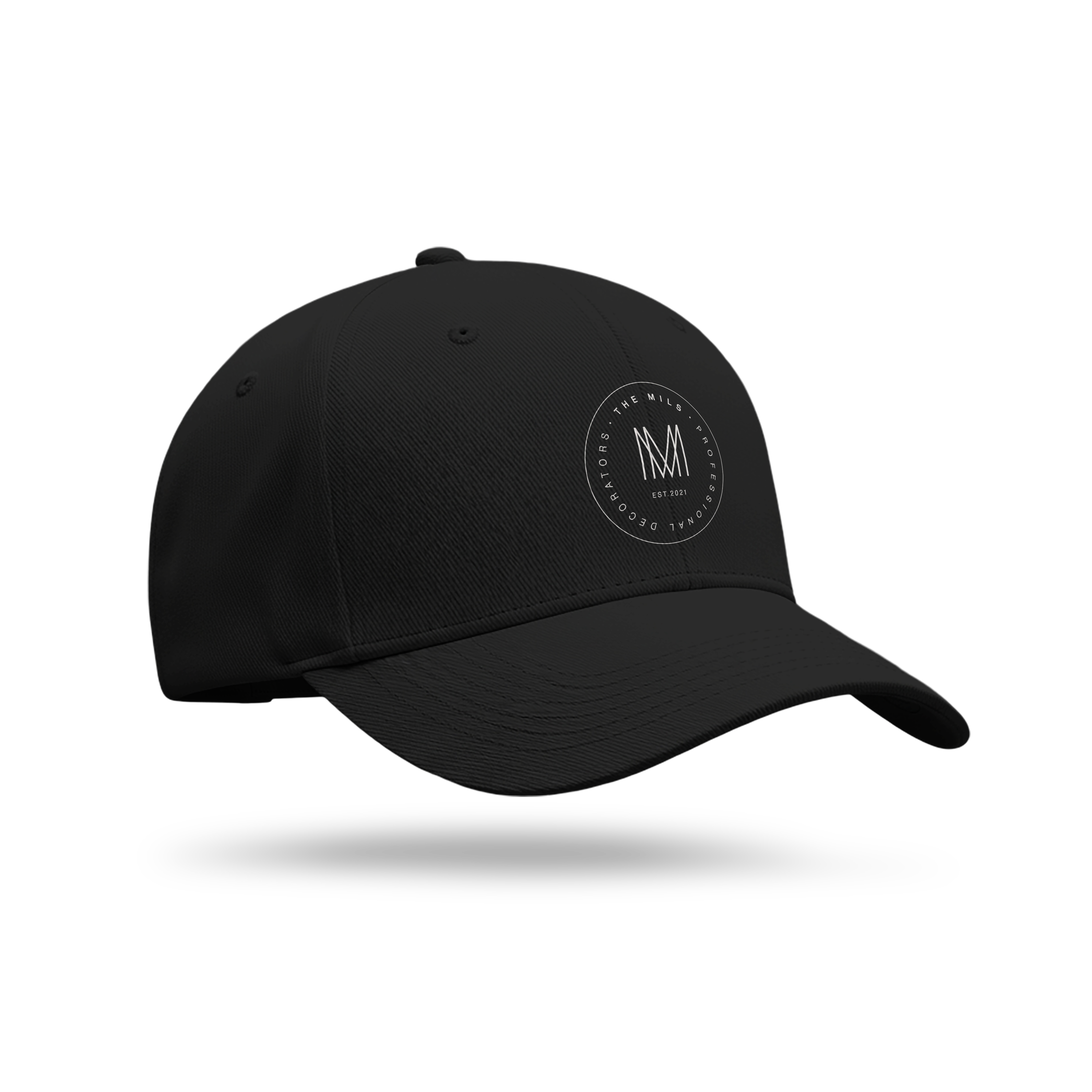
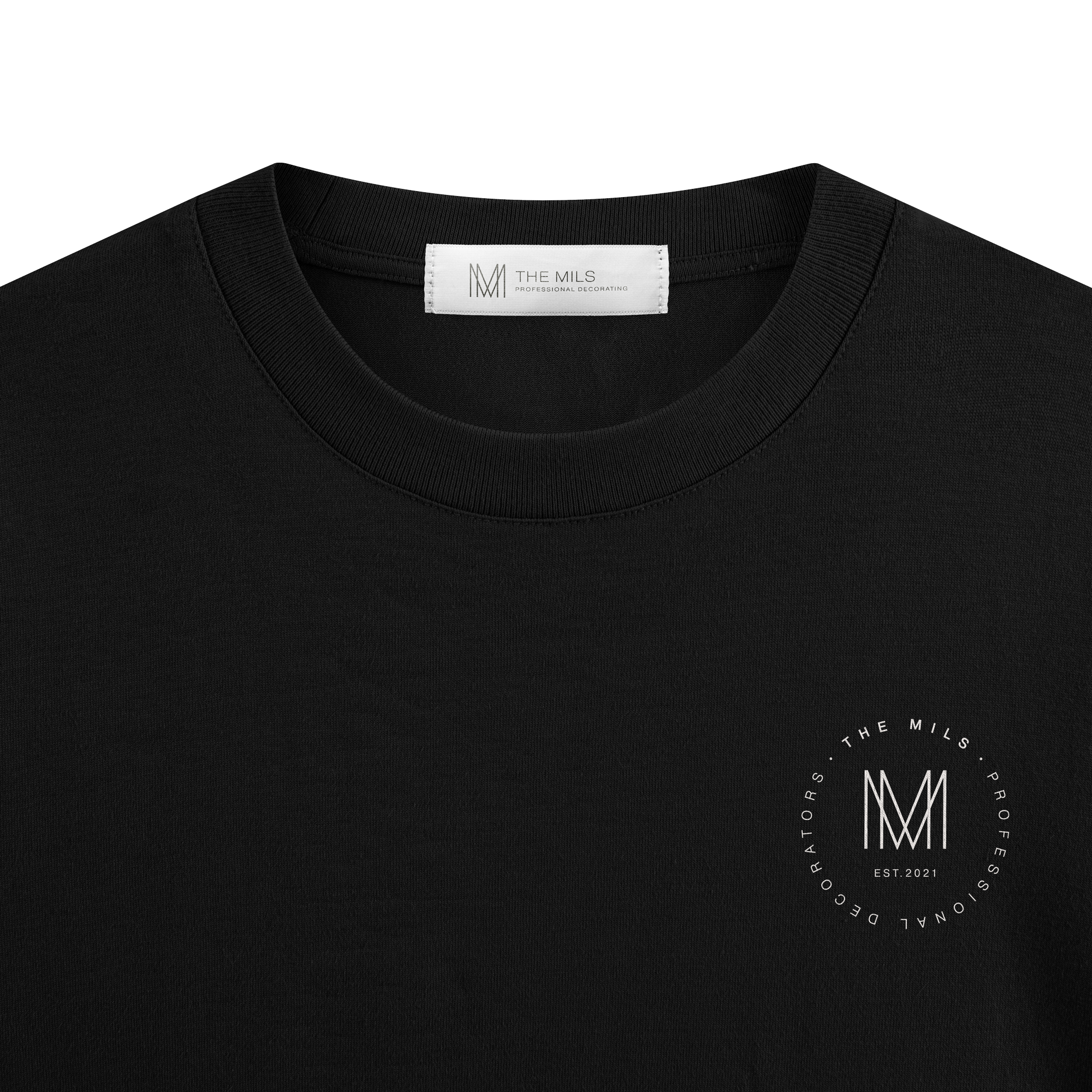
We moved the identity away from the conventions of trade branding and drew on Art Deco instead. Symmetry, strong geometry and carefully balanced proportions, to communicate order and craftsmanship. The mark is a bespoke monogram built from two interlocking M letterforms, a reference to founders Aaron Milton and Josh Milburn and the origin of The Mils name. Rather than predictable decorating imagery, it gives the company an ownable symbol closer to an architecture or interiors brand. A restrained black and white palette keeps the system timeless, while Pragmatica and Pragmatica Slab Serif balance clean contemporary type with more characterful editorial detail. Stacked, horizontal and icon-only variations cover every format, and enlarged crops of the monogram extend the identity into social content.
The result
Five years on, the business still runs the identity exactly as created. The Mils deliver interior and exterior decorating for domestic and commercial clients across Essex and Suffolk. In 2025 they received the Service Excellence Award at the Prestige Awards, with particular recognition for customer care, integrity and reliability. The identity set that expectation from the start. The work has continued to meet it.
next project
next project
next project
next project
next project
next project
next project
next project
next project
next project
next project
next project
Watts Carpentry + Construction
A carpentry identity with no tools in it.
Logo design